Gradient fieldsdepth · focus · atmosphere
A repeatable visual grammar, not a fixed color ramp. Fields bring the brand to life across product, marketing, and communications. Digital Green, Ink, Stone, and Night establish identity; complementary colors add atmosphere and meaning.
Gradient families
Each family is a starting palette, not a fixed token. Shift placement, scale, and intensity for the context.




Genome
Multi-color complementary field
Expressive · Code Genome


.mod-gradient--genome



Atmospheric accents
Composition-only colors for fields, illustration, and campaign atmosphere — not persistent brand or interface colors. Use no more than one as a small counterpoint; never for CTAs, navigation, body text, or product UI.
Intensity
Use the lowest chroma that communicates the idea. Atmosphere is the default.
- 01Mist5–15% chromaUI surfaces, modals, docs
- 02Atmosphere15–40% chromaProduct imagery, frames
- 03Expression40–70% chromaCampaigns, social, events
- 04Full expression70–100% chromaRare, meaning-led moments
Field anatomy
Unequal scale, position, and opacity create movement. One quiet edge keeps it usable.
- Base50–70%The quiet underlying field: Stone, Night, Blue, or Teal.
- Primary bloom20–40%The strongest chromatic region and visual focus.
- Secondary bloom10–30%Adds depth, dimension, and directional movement.
- Counterpoint0–15%A small contrasting accent — permission for coral or yellow.
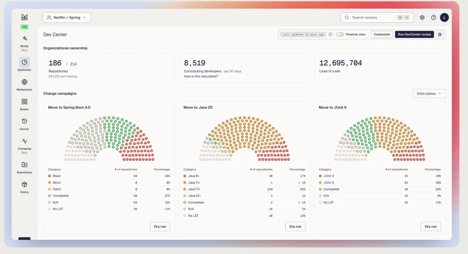
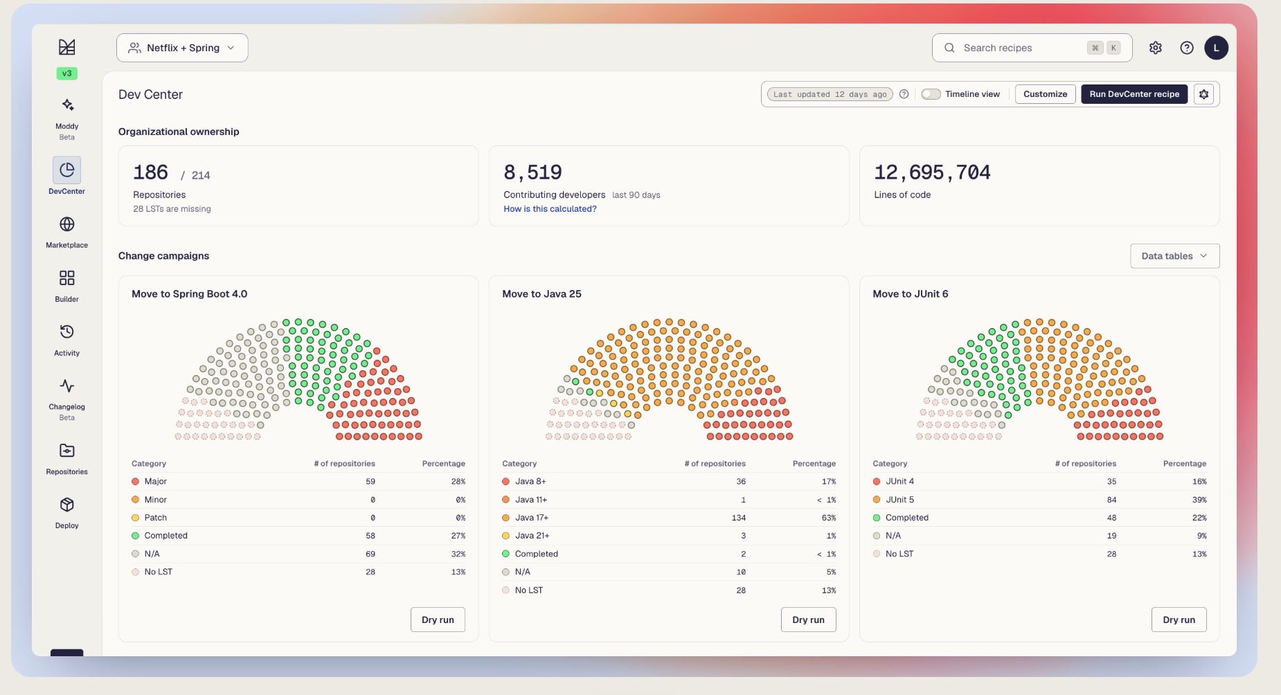
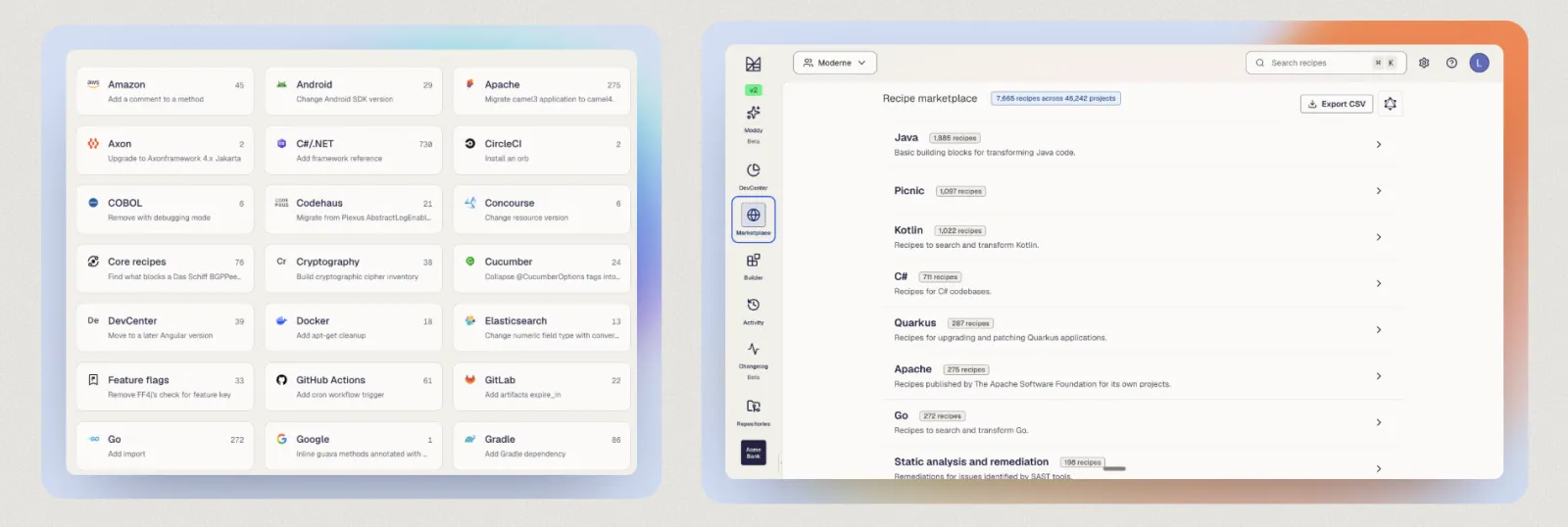
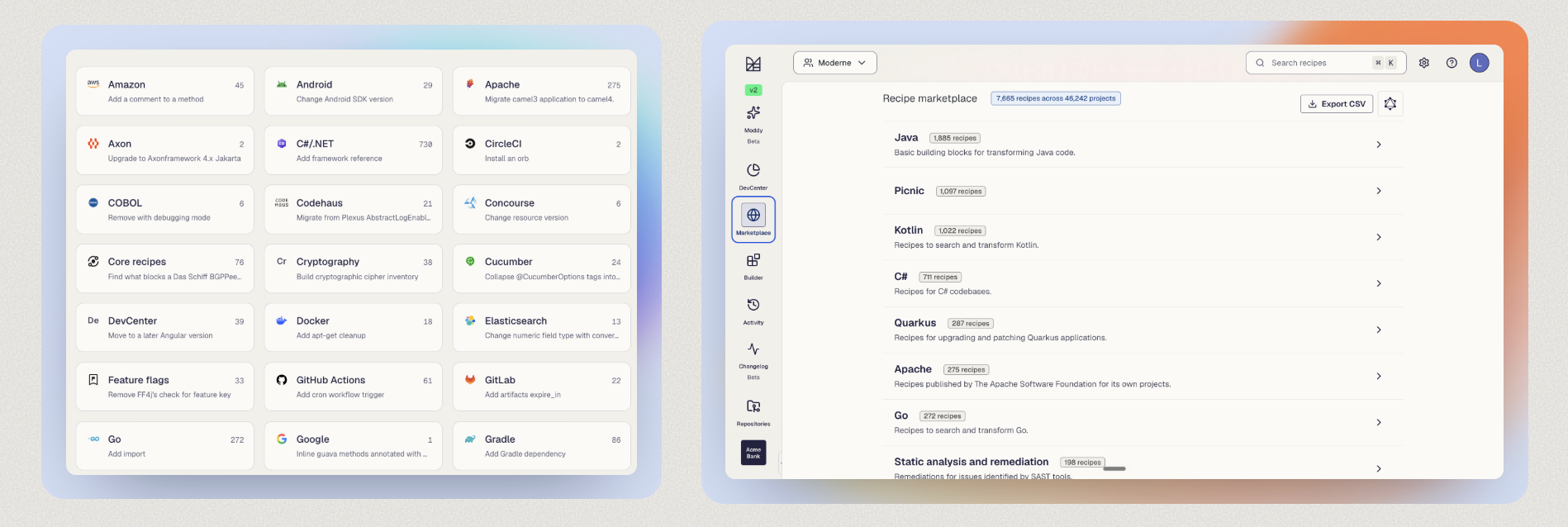
Proof screenshots & thumbnails
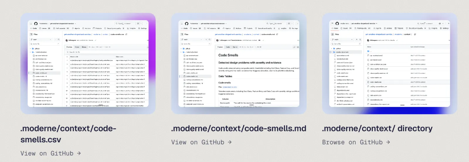
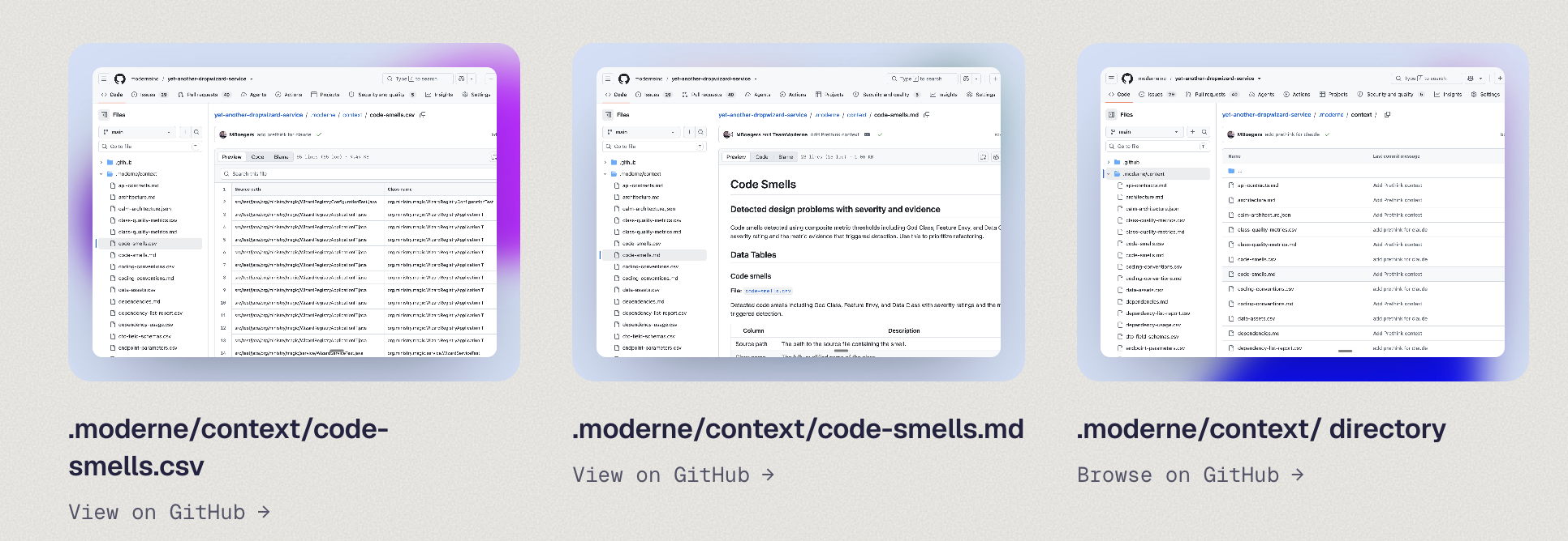
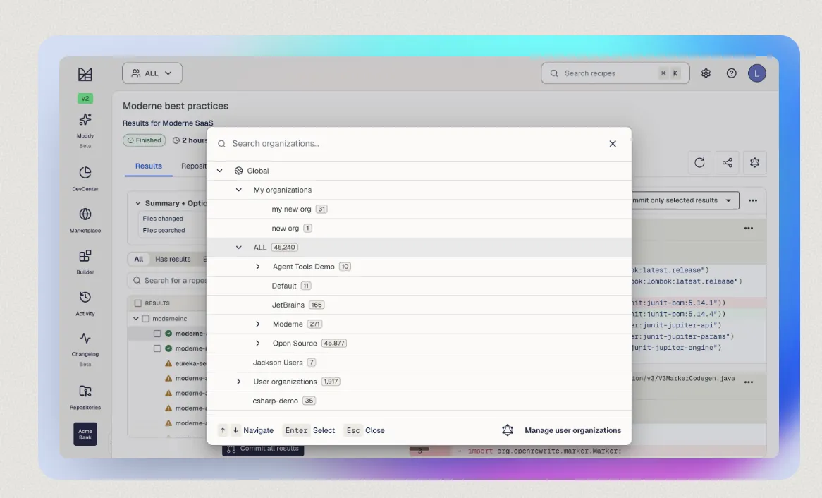
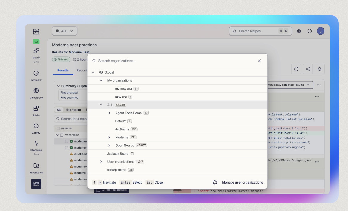
Product screenshots and thumbnails that demonstrate a chromatic frame around neutral UI. The frame belongs to these files — never tint the screenshot itself.
Construction checks
Do
- Build a clear hierarchy — one field dominates, one supports, one is a small counterpoint.
- Vary scale, position, opacity, and blur; preserve a useful quiet area.
- Let one edge carry more chroma while another stays quiet.
- Use Stone as the surrounding editorial canvas where possible.
Don't
- Equal-width rainbow strips — equal scale and spacing reads as a color reference, not a field.
- A second gradient around artwork that already carries one.
- Tinting a product screenshot; keep the UI neutral inside the frame.
- Rebuilding an approved field from simplified swatches or equal stops.