Get the Moderne Design Kit skill
Download the .skill bundle and drop it into your coding agent (Claude Code, etc.) to build on-brand Moderne UI.
This is a test page for the color palette, based on the product website. Use the toggle in the top right to switch between light and dark mode and see how each color behaves in both. From here we can start applying the changes across the documentation and the platform.
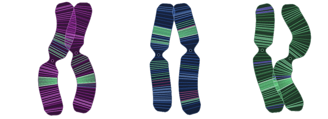
Your codebase
has a genome.
We sequence every repo into a Lossless Semantic Tree — a compiler-accurate model that delivers certainty, not probability. No more reading between the lines, because we've resolved them.
Moderne gives humans and agents deterministic tools to drive code change accurately and at scale whether across a single repo or 100,000 of them.
Strand spectrum
bright / deep · 8 pairsSix saturated brand color pairs
Each “strand” consists of a bright primary color on top and a deep companion shade underneath. Rather than generating darker versions algorithmically, each pair has been chosen to feel balanced and visually intentional.
What each pair represents
| Strand | Bright | Deep |
|---|---|---|
| Lime | #C7E84B | #4F5A12 |
| Green | #30F284 | #1D5937 |
| Teal | #25D0C0 | #0E4A45 |
| Blue | #3E7BF6 | #16306B |
| Violet | #9D5BE8 | #3F1340 |
| Magenta | #E6399B | #7A1E52 |
Why use paired colors?
Instead of relying on one color with varying opacity or automatically darkening it, each strand provides two intentional values. This keeps the color relationships consistent across different contexts.
Interactive elements, fills, highlights, buttons.
Text on bright backgrounds, charts, dark themes, emphasis, borders.
“Bright / deep · 8 pairs”
The note in the top-right of the palette suggests this is one section of a larger set: bright = vivid, energetic colors; deep = darker companion colors; 8 pairs = the complete palette likely contains eight color families, although only six are shown here.
Design philosophy
This palette feels intentionally:
- Highly saturated without becoming fluorescent
- Modern and digital-first
- Suitable for data visualization — each hue is clearly distinguishable
- Accessible when bright and deep values are paired correctly
- Flexible enough for light and dark themes