Digital Green
#30F284Action on dark
Welcome to the design kit. Everything you need for your next project lives here, whether it's a prototype, a Canva layout, or HTML. If something's missing, post in the design channel and we'll add it.

Core identity · Primary palette
Digital Green is the action color on dark surfaces. On light surfaces it shifts to Deep Green for accessible contrast. Ink, Stone, and Night provide the stable grounds that make the green signal unmistakable.
Palette update
The six-color ramp is no longer a primary identity device, required sequence, or default decoration. The five colors below are the Moderne brand spine. Former spectrum hues now act as supporting complementary colors: use them selectively for gradient fields, illustration, data visualization, and moments where category or sequence needs distinction.
#30F284Action on dark
#1D5937Action on light
#232342Type on light
#F2F0EAPaper ground
#100C0ADark ground
These colors expand expression without competing with Digital Green. Use one or two at a time, preserve a clear hierarchy, and keep primary UI surfaces neutral.
#E6399B#7A1E52#9D5BE8#3F1340#3E7BF6#16306B#25D0C0#0E4A45#C7E84B#4F5A12Use Digital Green or Deep Green for action, Ink or Night for type and dark grounds, and Stone for editorial space. These should carry the first read.
Use complementary hues for atmosphere, categorization, and narrative emphasis. They support the brand; they do not replace its green, Ink, Stone, and Night foundation.
Digital Green (#30F284) is the action color on dark surfaces, but on white it falls to about 1.5:1 contrast — far below the WCAG 2.1 AA minimum of 4.5:1 — so it cannot carry text or links on light backgrounds. On light surfaces we shift to a deeper companion green (#1D5937, ~8:1 on white) that preserves the green-means-action cue while staying legible. Green is always paired with an underline or icon, so color is never the sole indicator, satisfying WCAG 1.4.1 (Use of Color).
Visual language · Gradient fields
A repeatable visual grammar built from primary brand anchors and a supporting complementary palette—not a fixed color ramp.
Fields bring the Moderne brand to life across product, marketing, and communications. Digital Green, Ink, Stone, and Night establish identity; complementary colors add atmosphere and meaning.
The primary palette anchors the brand. Complementary colors expand expression without becoming a second identity system.
01 — Primary brand anchors
#30F284#1D5937#232342#F2F0EA#100C0A02 — Supporting complementary colors
#E6399B#9D5BE8#3E7BF6#25D0C0#C7E84B03 — Atmospheric accents
Composition-only colors for gradient fields, illustration, and campaign atmosphere. They are not persistent brand or interface colors.
#FF6B5BWarm counterpoint · launches#FFD84DLight and optimism · small blooms#7EDBFFCool atmosphere · transitions#D7F7F7Quiet glow · mist and depthUse no more than one atmospheric accent as a small counterpoint in a field. Never use these colors for CTAs, navigation state, body text, or persistent product UI.
Each family is a starting palette, not a fixed token. Shift placement, scale, and intensity for the context.
Teal + Blue + Violet
Technical · Product frames
.mod-gradient--coolBlue + Magenta · Coral accent
Energetic · Editorial
.mod-gradient--warmMulti-color complementary field
Expressive · Code Genome
.mod-gradient--genomeLime + Teal + Blue
Optimistic · Agent stories
.mod-gradient--freshViolet + Blue + Stone
Quiet · UI backgrounds
.mod-gradient--mistCopy, paste, customize
Copy the full preset library, download it as a file, or grab the structured JSON tokens for design tools and generators.
The family buttons above copy only the selected preset. The library includes all color tokens, five fields, and the chromatic-frame pattern.
<link rel="stylesheet" href="gradient-presets.css">

<div class="mod-gradient mod-gradient--cool">
  <!-- Add content here, or use as a frame -->
</div>

<div class="mod-chromatic-frame">
  <img src="product-ui.png" alt="Product screen">
</div>Use the lowest chroma level that communicates the idea. Atmosphere is the default Moderne treatment.
5–15% chroma
UI surfaces, modals, docs
15–40% chroma
Product imagery, frames
40–70% chroma
Campaigns, social, events
70–100% chroma
Rare, meaning-led moments
Unequal scale, position, and opacity create natural movement. One quiet edge keeps the composition usable.
The quiet underlying field: Stone, Night, Blue, or Teal.
The strongest chromatic region and visual focus.
Adds depth, dimension, and directional movement.
A small contrasting accent—permission for coral, red, or yellow.
Use these approved source fields directly. Do not rebuild them from simplified swatches or equal color stops.
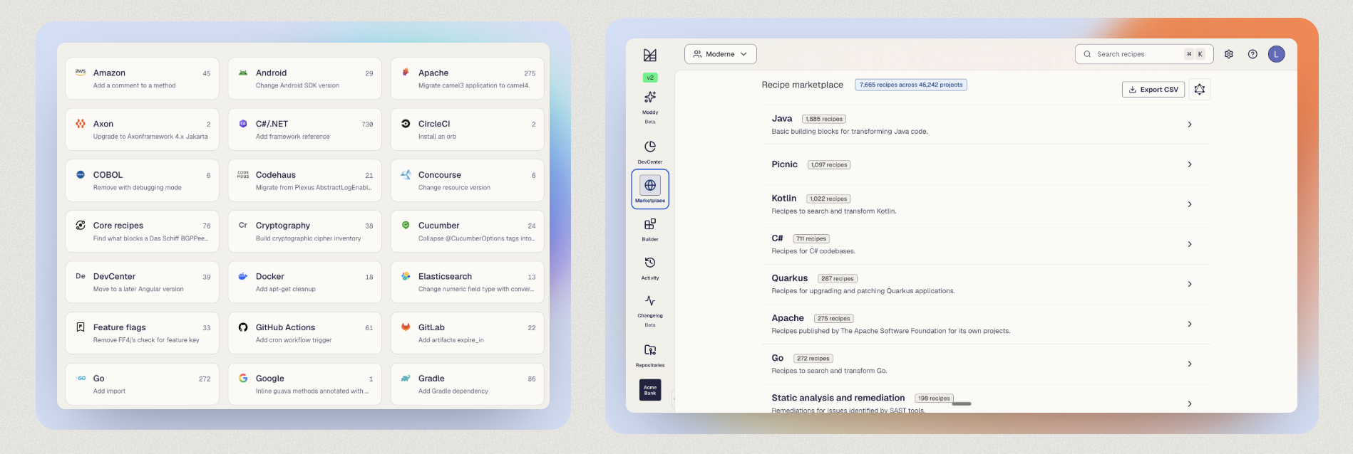
Bring brand expression to neutral product UI without tinting or compromising the screenshot itself.
Choose the surround based on the content. Do not add a second gradient around artwork that already carries one.
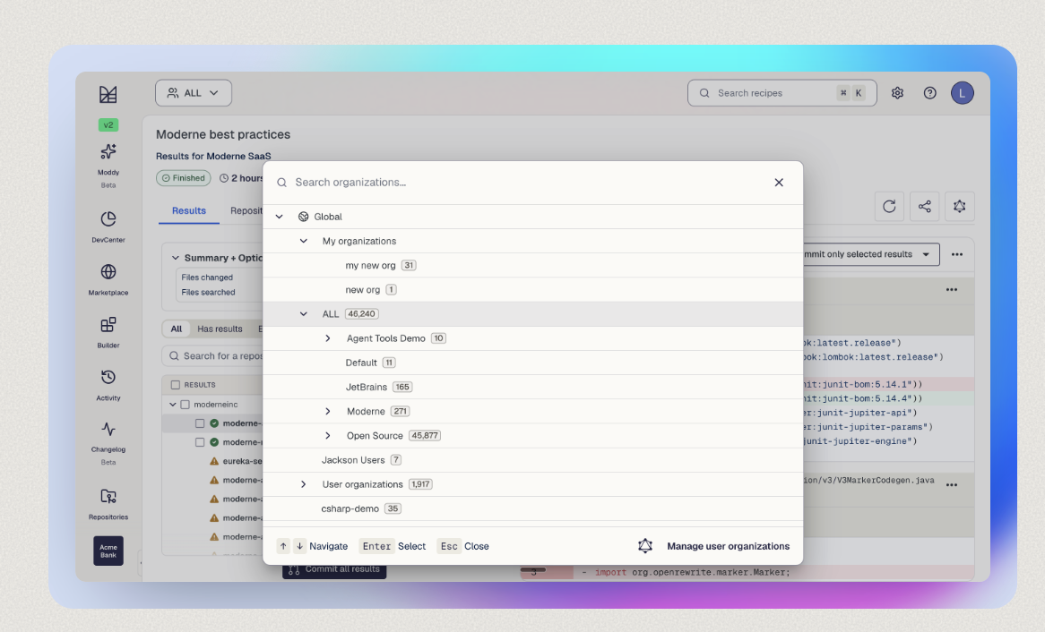
Place modals, hero artwork, and other internally chromatic imagery on Stone or another neutral surface.
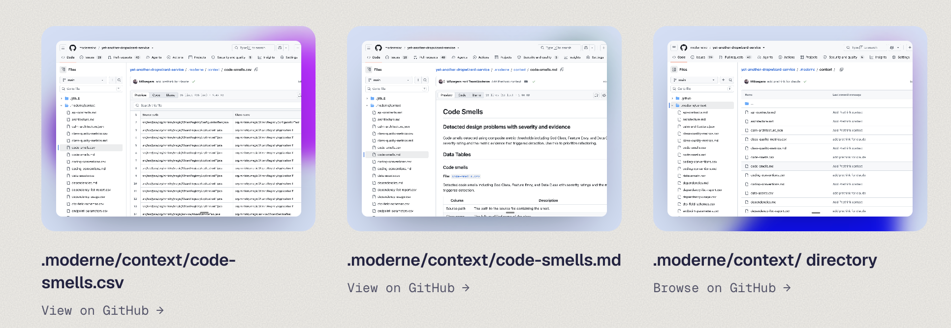
Add a controlled chromatic surround to neutral product imagery, code examples, and thumbnails.
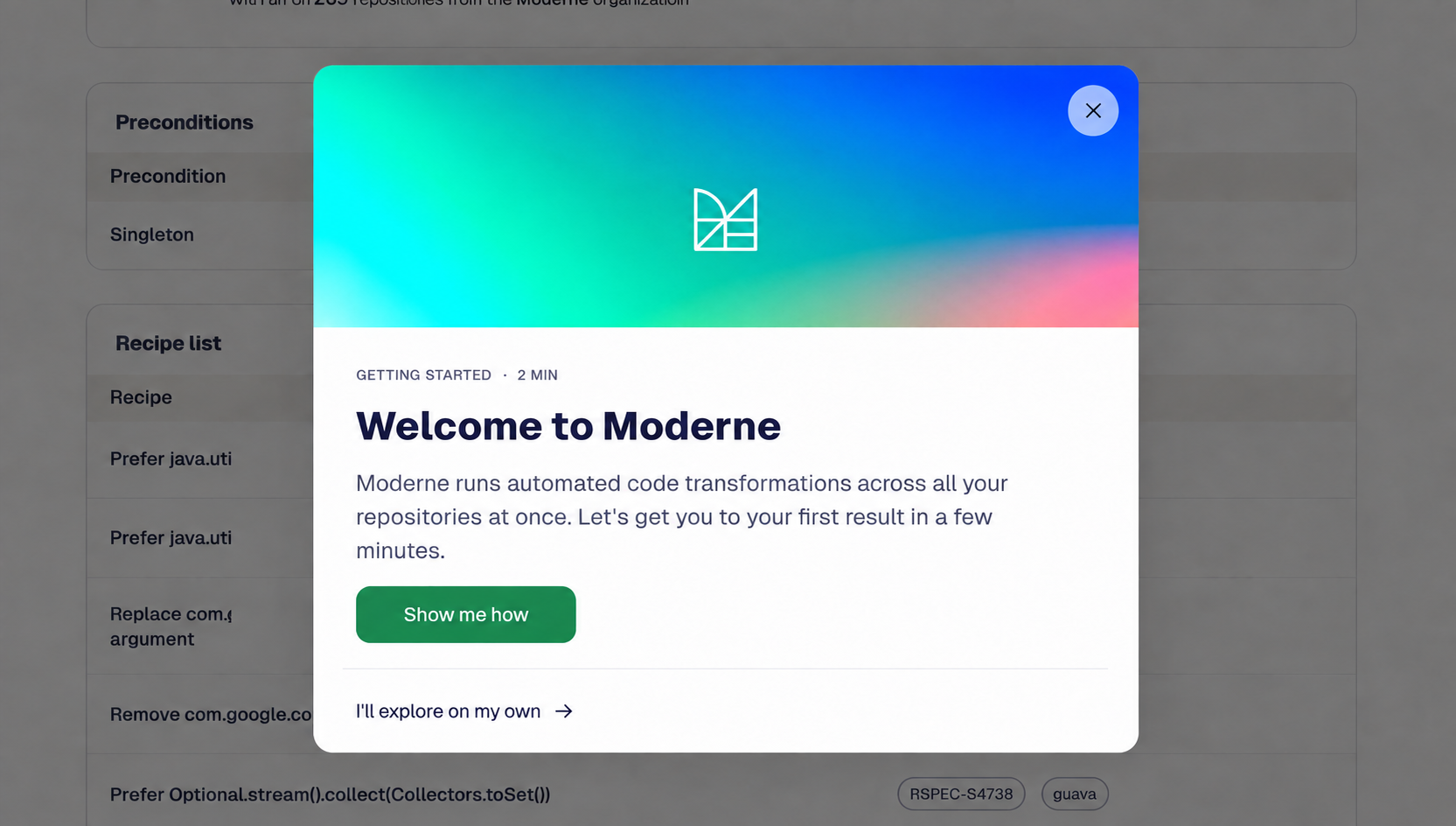
Use a quiet teal-and-blue artwork as a contained visual header, then keep onboarding copy and actions on a completely neutral surface.
Plain surround · Internal gradientReserved for an additional approved example.
Example pending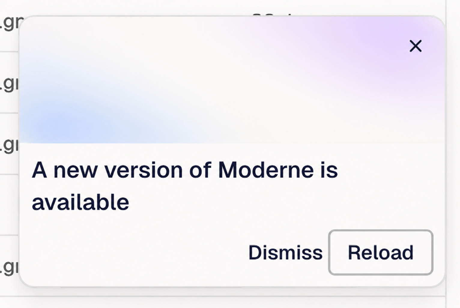
Use the smallest field that clarifies hierarchy; controls and supporting UI should stay on neutral surfaces.
Plain surround · Internal gradientThese files demonstrate gradient framing around neutral product UI, code, and thumbnail content. Download and use the supplied PNGs directly.
The difference between a palette strip and a Moderne field is composition.
Equal scale and spacing feels like a color reference, not a field.
Vary scale, position, opacity, and blur. Preserve a useful quiet area.
Use these comparisons to evaluate a field before it ships. The goal is a recognizable system with room for expression.
Let one field dominate, one support, and one act as a small counterpoint. Avoid equal-width rainbow strips.
Offset color fields and vary their scale. Avoid stacking every bloom on the center point.
Keep at least one area low-chroma for copy, UI, or visual rest. Don’t activate every corner.
Use soft or atmospheric blooms at 30–90% of the asset width. Avoid crisp circles and visible hard stops.
Coral, yellow, sky, and pale cyan may shape a composition, but they are not primary brand colors or persistent UI accents.
Keep screenshots neutral and let the gradient show around their edges. Preserve product fidelity.
Place copy in a quiet field with reliable contrast. Don’t position text over the strongest bloom.
Do not use the former six-color sequence as an identity device. Compose two or three colors around a clear purpose and hierarchy.
Can you identify the dominant field in under a second?
Is at least one edge quiet enough to support content?
Are there only two or three major blooms?
Do complementary colors support a primary brand anchor?
Is product UI neutral, legible, and untinted?
Does the intensity match the context and message?
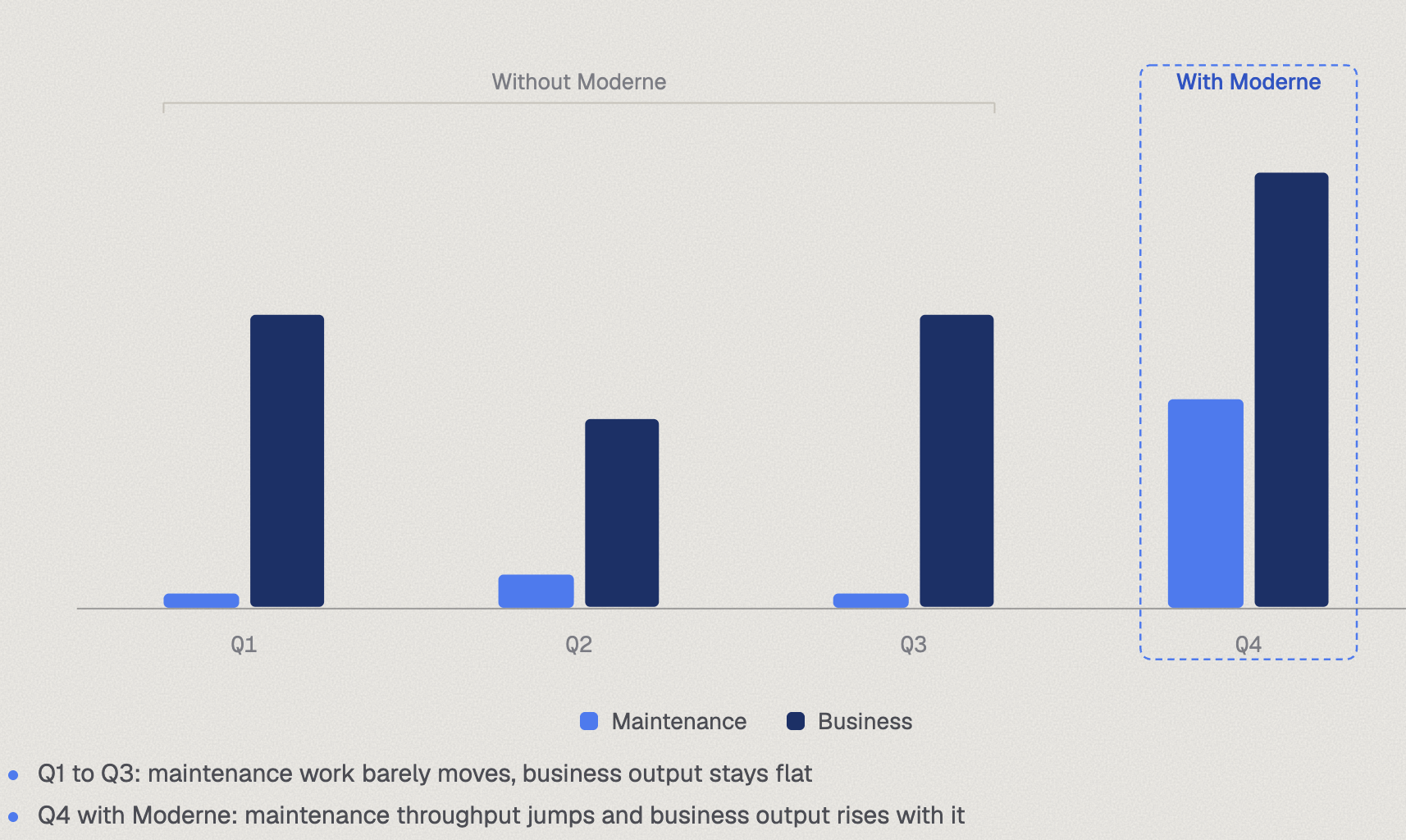
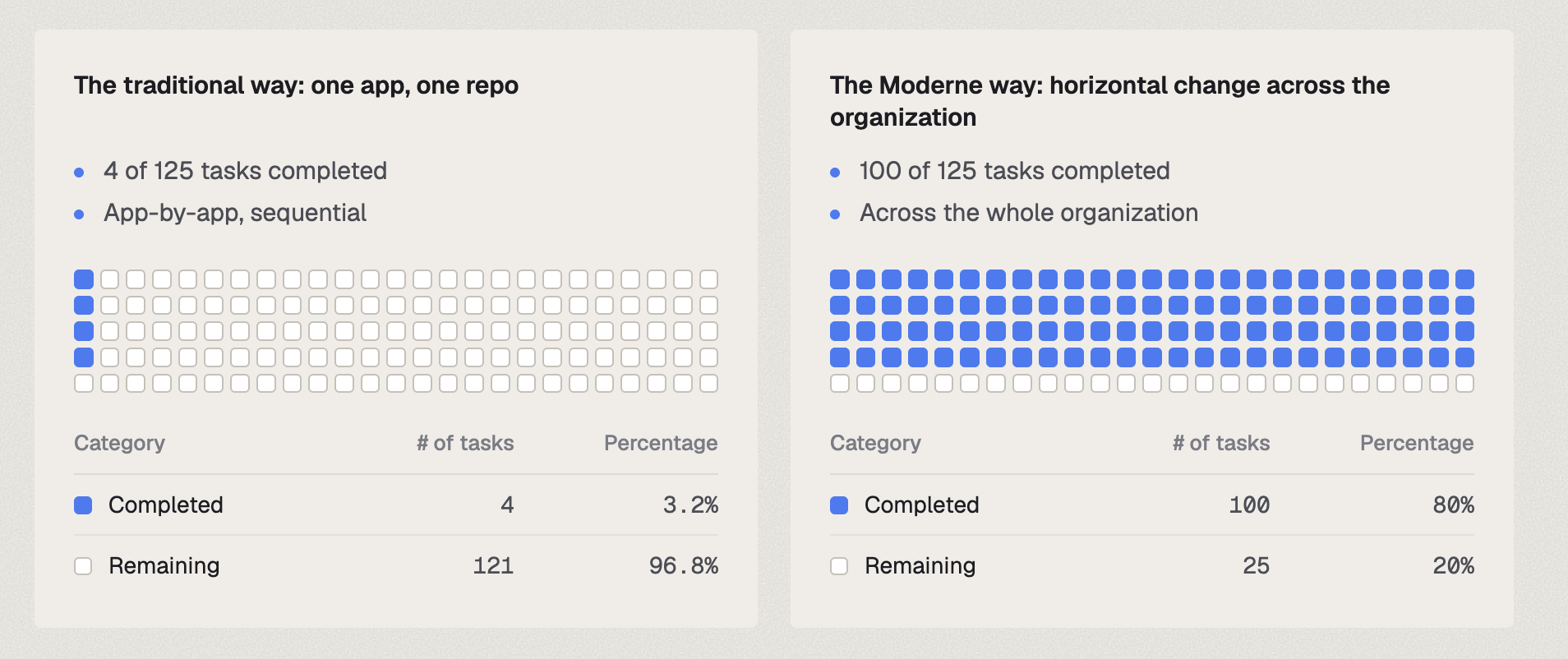
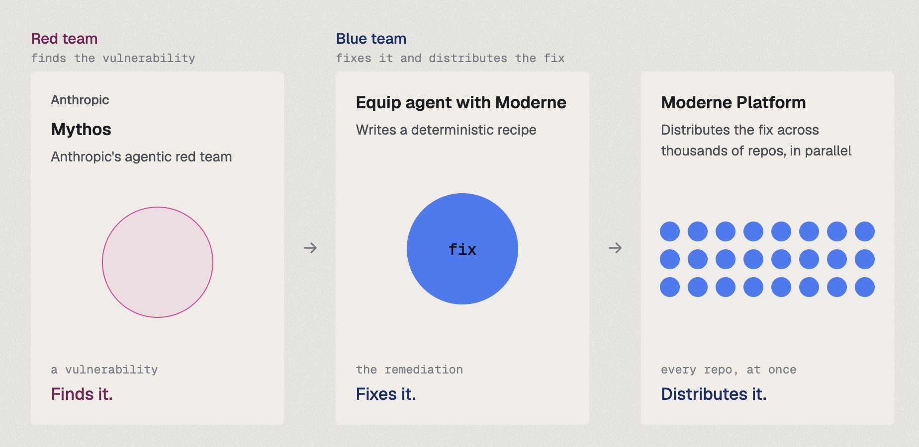
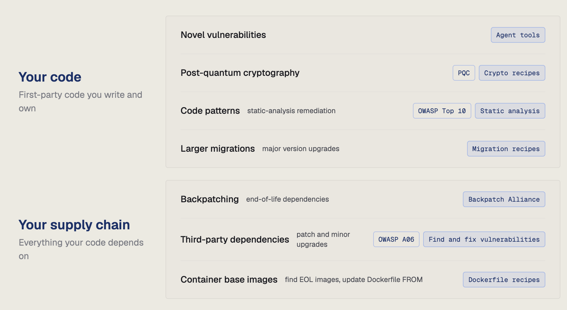
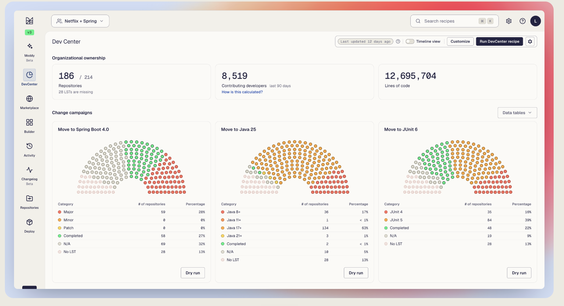
Data visualization · Approved assets
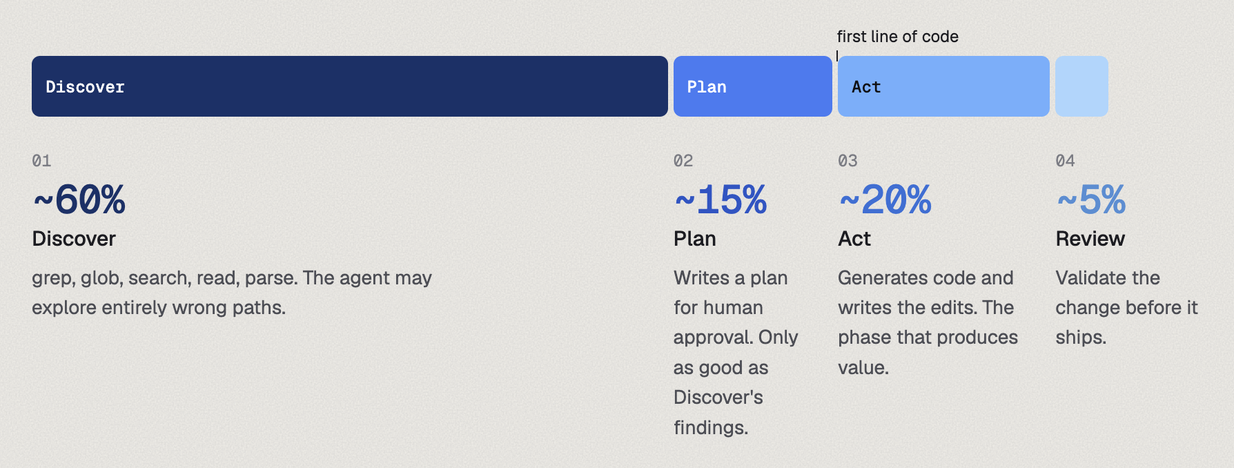
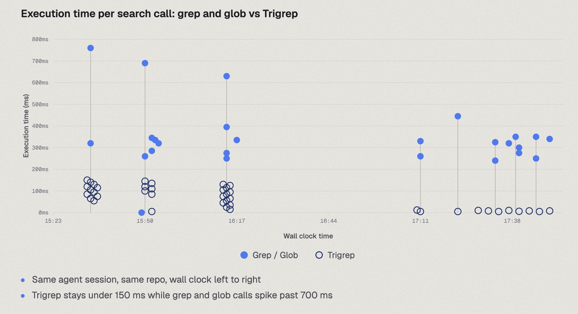
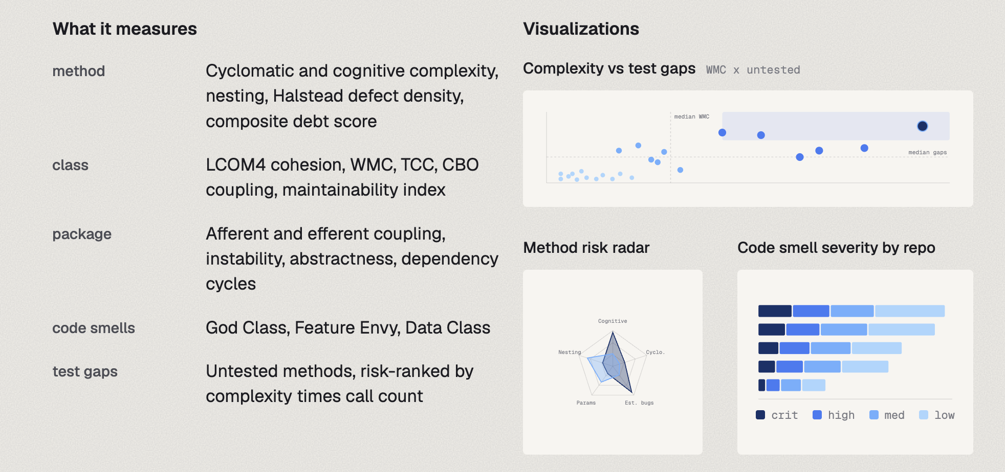
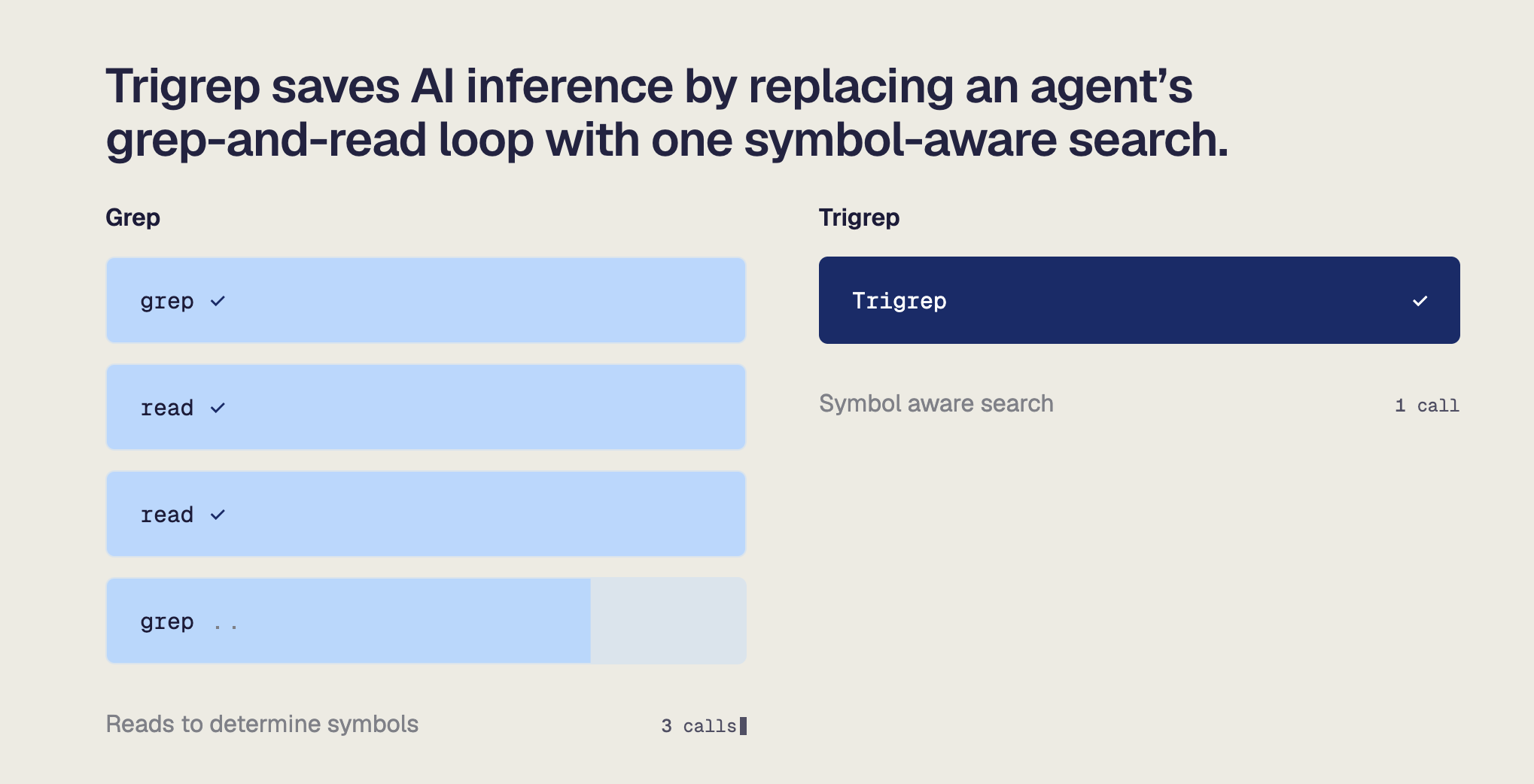
Reusable graph and diagram compositions drawn from approved Moderne work.
Download the original PNGs for presentations, documents, and working files. Preserve the typography, color hierarchy, spacing, and annotations shown here.